# 1893 - 1981 18c Flags/Purple Mountains Majesties
U.S. #1893
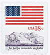
1981 18¢ Flag Over Mountains
Flag and Anthem Issue
- From the first simultaneous American flag stamp issue with different designs & formats
- One of the first definitive stamps issued for the 18¢ first-class rate
- Illustrates a line from “America the Beautiful”
Stamp Category: Definitive
Set: Flag and Anthem
Value: 18¢; first-class rate
First Day of Issue: April 24, 1981
First Day City: Portland, Maine
Printed by: Bureau of Engraving & Printing
Printing Method: Engraved
Format: Booklet panes of 8 (two #1892; six #1893)
Perforations: 11x10.5 on 2 or 3 sides
Why the stamp was issued: As part of a set of patriotic flag stamps available in pane, coil, and booklet formats for the new 18¢ first-class rate that went into effect March 22, 1981.
About the stamp design: This stamp was designed by Peter Cocci of the Bureau of Engraving and Printing. It pictures purple mountain peaks, illustrating the line below it that reads, “for purple mountain majesties.” A portion of the Grand Teton mountains near Jackson Hole, Wyoming are said to have served as the design inspiration for this image. The booklets were designed for sale only in vending machines.
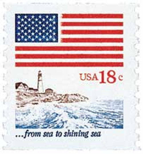
First Day City: The First Day Ceremony for the Flag and Anthem stamps was held in Portland, Maine. While it wasn’t identified as such on the stamp, Portland’s coastline served as the design inspiration for the “sea to shining sea” stamp.
Unusual fact about this stamp: US #1893 has been found imperforate between.
About the Flag and Anthem Issue: All of the stamps in the set were designed by Peter Cocci of the Bureau of Engraving and Printing. Three of the stamps follow the same design format, with a large US flag filling the top half of the stamp. “USA” and the denomination are printed in red below that on the left-hand side. And below that is an image and line from “America the Beautiful.”
The coil, #1891, depicts waves crashing on a beach, with a lighthouse and homes nearby. Reportedly, the coastline was inspired by that of Portland, Maine. The scene is accompanied by the line “from sea to shining sea.”
The 6¢ stamp, #1892, which accompanies the Flag and Mountain booklet stamp, was designed to resemble Revolutionary-era American flags, with 13-white stars surrounding the denomination, all on a blue field.
The 6¢ stamp, #1892, which accompanies the Flag and Mountain booklet stamp, was designed to resemble Revolutionary-era American flags, with 13-white stars surrounding the denomination, all on a blue field.
About US Flag Stamps: The American flag first appeared as a smaller element of a US stamp on the 1869 Eagle and Shield Pictorial (US #121). A handful of stamps in the coming years included the flag in much the same way. Then, on July 4, 1957, the US Post Office issued its first stamp with the American flag as the central element (US #1094). It was also the first stamp printed by the Giori press, which allowed the design to be printed in its natural colors in one step.
Upon hearing the news, some collectors and citizens were outraged. Because the stamps would be canceled, they saw it as disrespectful. They flooded the post office with angry letters citing American legal code that prohibited the reproduction of “the national emblem for disloyal or commercial purposes.” Conversely, many people were also happy about the stamp, praising its beautiful colors and patriotic design. The Post Office stated the stamp was meant to be a reminder of America’s heritage and hard-won liberty.
The stamp proved popular and was followed by two more commemoratives featuring updated 49- and 50-star flags in 1959 and 1960, respectively. Then in 1963, the Post Office started a new tradition. Nearly every year since, there’s been at least one definitive picturing the US flag. For many years, it was the flag “over” something such as a national landmark. Over time, the USPS has grown creative to find new ways to celebrate the American flag every year with a different design.
History the stamp represents: On July 22, 1893, Katharine Lee Bates wrote America the Beautiful.
In 1893, 33-year-old college professor Katharine Lee Bates traveled to Colorado to teach a short summer English course. Along the way, she stopped at the World’s Columbian Exposition in Chicago, where the alabaster “White City” moved her. And as she rode the train through America’s heartland, she was awestruck by the expansive wheat fields.
As Bates later recalled, “One day some of the other teachers and I decided to go on a trip to 14,000-foot Pikes Peak. We hired a prairie wagon. Near the top we had to leave the wagon and go the rest of the way on mules. I was very tired. But when I saw the view, I felt great joy. All the wonder of America seemed displayed there, with the sea-like expanse.”
When Bates approached Colorado Springs, she noticed how the granite of Pikes Peak gave the mountains a purple hue. As she stood on the summit of the mountain, a poem came to mind. She returned to her room at the Antlers Hotel and immediately wrote it down. She initially titled the poem, “Pikes Peak.”
Two years later, the poem appeared in the church periodical, The Congregationalist, for the Fourth of July. As the poem gained popularity, it was set to different pieces of music. Perhaps the most popular was Samuel A. Ward’s Materna. The poem and song were first combined in 1910 and titled, “America the Beautiful.”
Some have suggested “America the Beautiful” should be our country’s national anthem, but “The Star-Spangled Banner” continues to hold that place of honor. “America the Beautiful” describes the wonders of our vast and diverse nation and has been sung by world-renowned artists over the years.


